
What Makes a Brand Stick? 5 Powerful Must-Haves for a Visual Identity That Actually Works

(Spoiler: It's way more than just a logo.)
When business owners dream of launching something special, the first ask is usually the same: “Can I get a logo?” But behind that seemingly simple request is a deeper desire — for meaning, consistency, and connection. And that’s exactly what great branding delivers.
Let’s break down the five essential elements that transform a visual identity from forgettable to magnetic — and why skipping any of these can cost you more than you think.
What Makes a Brand Stick
At its core, a “sticky” brand is one people remember, trust, and emotionally connect with. It goes beyond design and dives into strategy, storytelling, and consistency. While a logo is the most recognized piece, it's just one part of the whole brand ecosystem.
A Strategic Foundation: Laying the Groundwork for a Cohesive Brand
Before you open up Adobe Illustrator or choose a color palette, there’s foundational work to be done. You must define who you are, what your business stands for, and who you’re trying to reach.
This means clarifying your mission, your audience’s desires, and what sets you apart in your industry. It’s not fluff — it’s the backbone of a resilient and resonant brand.
Real-life impact? When clients undergo this deep brand discovery, they walk away with clarity — not only visually, but also in their messaging, marketing, and sales.
What This Looks Like:
One-on-one brand discovery sessions
Ideal client profiles and customer journey mapping
Competitive analysis and positioning exercises
A Logo System: More Than a Pretty Symbol
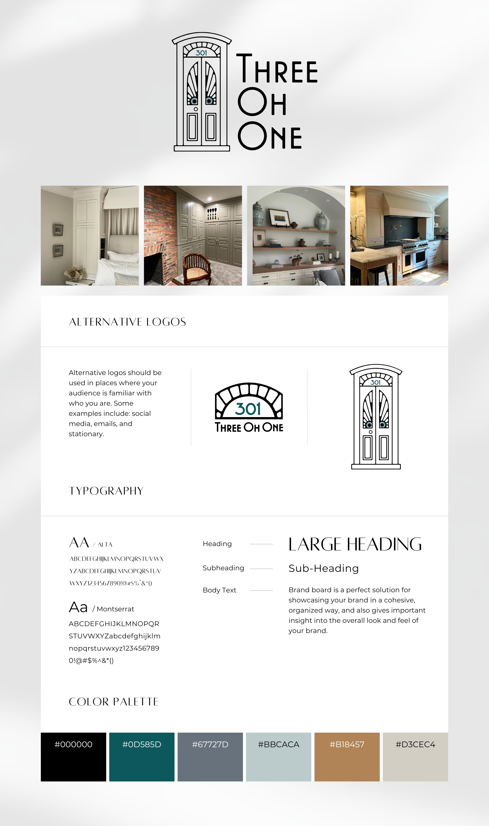
A logo system is a suite of assets that adapts to every touchpoint. Think: primary logos, secondary marks, icons, and responsive design that flexes for digital and print.
When you see brands like Nike or Apple, it’s not just their symbols that stick — it’s their consistency and adaptability.
Why It Matters:
Your logo needs to look great on a billboard and a business card
A full system ensures recognizability on social, websites, merch, and more
Builds trust through repetition and visual memory
Includes:
Primary logo
Wordmarks
Icon or favicon
Vertical and horizontal variations
Transparent and inverse versions
A Cohesive Visual Language: Fonts, Colors & Patterns That Speak Volumes
Fonts, colors, textures, patterns, and icons may seem like accessories — but they’re actually the tone-setters of your brand. They help your audience feel something before they even read a word.
Do you want your brand to feel bold? Soft? Playful? Professional? Visual language communicates that before anything else.
What We Build Together:
Custom color palette tailored to your brand psychology
Typography system with hierarchy and contrast
Patterns, illustrations, or iconography aligned with your vibe
And guess what? When all these pieces harmonize, your brand feels instantly trustworthy.
Clear, Confident Brand Guidelines: Your Visual GPS
Ever seen a logo stretched out awkwardly on a flyer? Or a brand use ten different shades of blue across their website and social? That’s what happens without guidelines.
Brand guidelines are your playbook — ensuring consistency across all platforms, campaigns, and collaborators.
You’ll Walk Away With:
A brand board or multi-page guideline PDF
Logo usage rules and restrictions
Font and color usage instructions
Layout templates and example applications
This document is gold for designers, marketers, social media managers — even your print shop.
Emotional Resonance: The Secret Sauce to Brand Loyalty
The best brands feel like something. They're not just well-designed — they connect. They’re human. They mirror back the values, aspirations, and emotions of the audience they serve.
And no, it doesn’t happen by accident. Resonance is crafted through intention, storytelling, and heart-centered design.
How We Build It:
Brand messaging that speaks your audience’s language
Visual elements that evoke your unique vibe
Strategy that connects brand personality with client emotion
The result? People don’t just see your brand — they feel it. And that feeling builds loyalty.
Why You Need More Than Just a Logo
Yes, a great logo is vital. But without the structure behind it — strategy, consistency, emotion — it’s like a house without a foundation.
At Flower Buds Creative, we don’t just hand over a logo. We build identities rooted in meaning, built to grow, and ready to resonate.
Ready to feel proud of your brand again? Let’s create something unforgettable together.
FAQs
-
A logo is a symbol — but branding is the full story. It includes your voice, colors, fonts, message, and emotional impact.
-
Most comprehensive packages include a logo system, color palette, typography, supporting visuals, and brand guidelines.
-
Absolutely! Without guidelines, your visuals become inconsistent, which erodes trust and makes your brand look unprofessional.
-
Brands that connect emotionally with their audience foster deeper trust and loyalty. People buy with emotion, not just logic.
-
A logo system includes multiple versions of your logo for flexibility, such as icons, vertical or horizontal layouts, and alternate colors.
-
If your visuals feel outdated, inconsistent, or no longer aligned with your mission or audience, it’s time to evolve your brand.